Discover
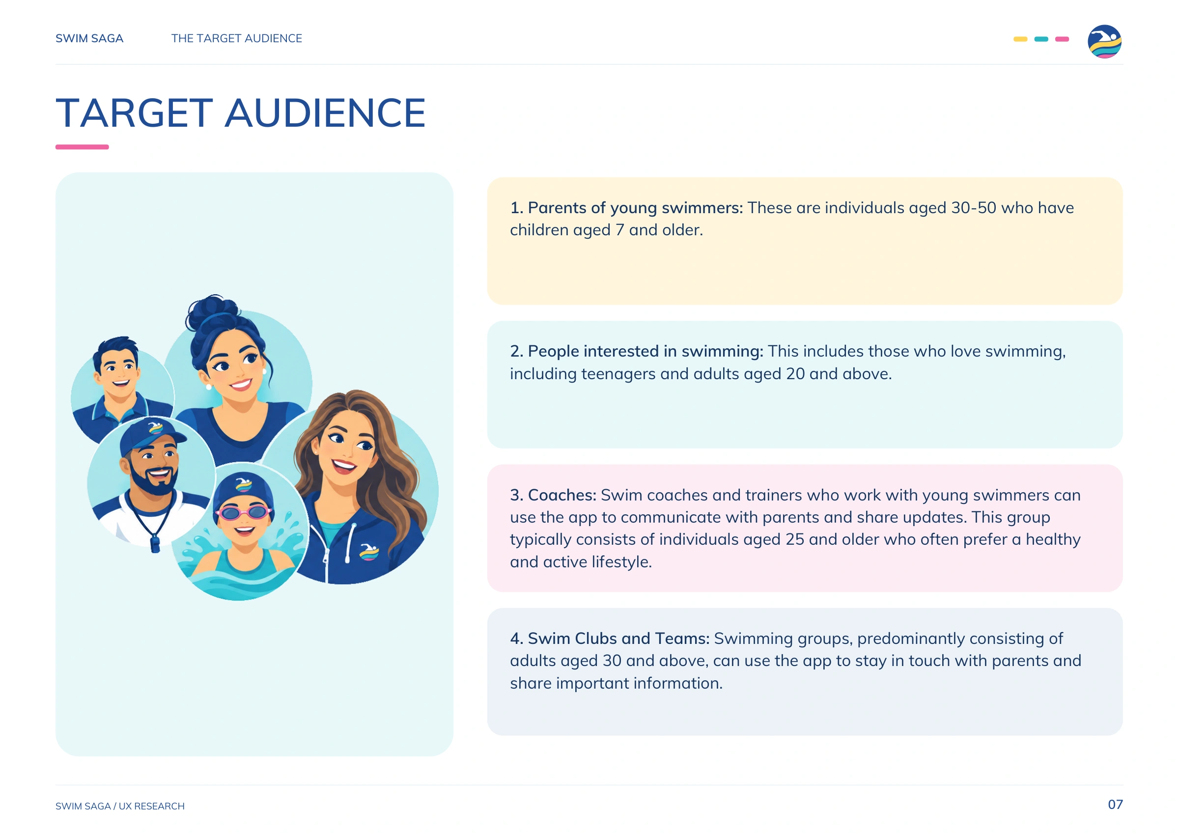
Interviews, surveys and comparable-app reviews surfaced routines, expectations and points of friction.

ClientSwim Saga
ScopeBrand identity, UX research, app and responsive web design
AudienceSwimmers, athletes, parents and clubs
ApproachEnergetic, social and easy to navigate
Swim Saga is a digital platform designed for swimmers, athletes, parents and swimming clubs. It brings the information and conversations surrounding training into one clear experience—from timetables, meets and events to club updates, athlete profiles, parent chats, messages, photos, videos and shared stories.
Cat and Bird Studio created the brand identity and the complete UX/UI direction for mobile and responsive web. The aim was to make a feature-rich platform feel light, welcoming and immediately familiar, so families and athletes could find what they needed without working through complicated menus.
The identity combines a swimmer silhouette with layered wave bands inside a compact circular icon. Deep blue communicates confidence and sporting focus, while turquoise, yellow and pink introduce energy, movement and a friendly community character. The bold stacked wordmark remains clear at app-icon scale and gives the brand a recognisable presence across screens.
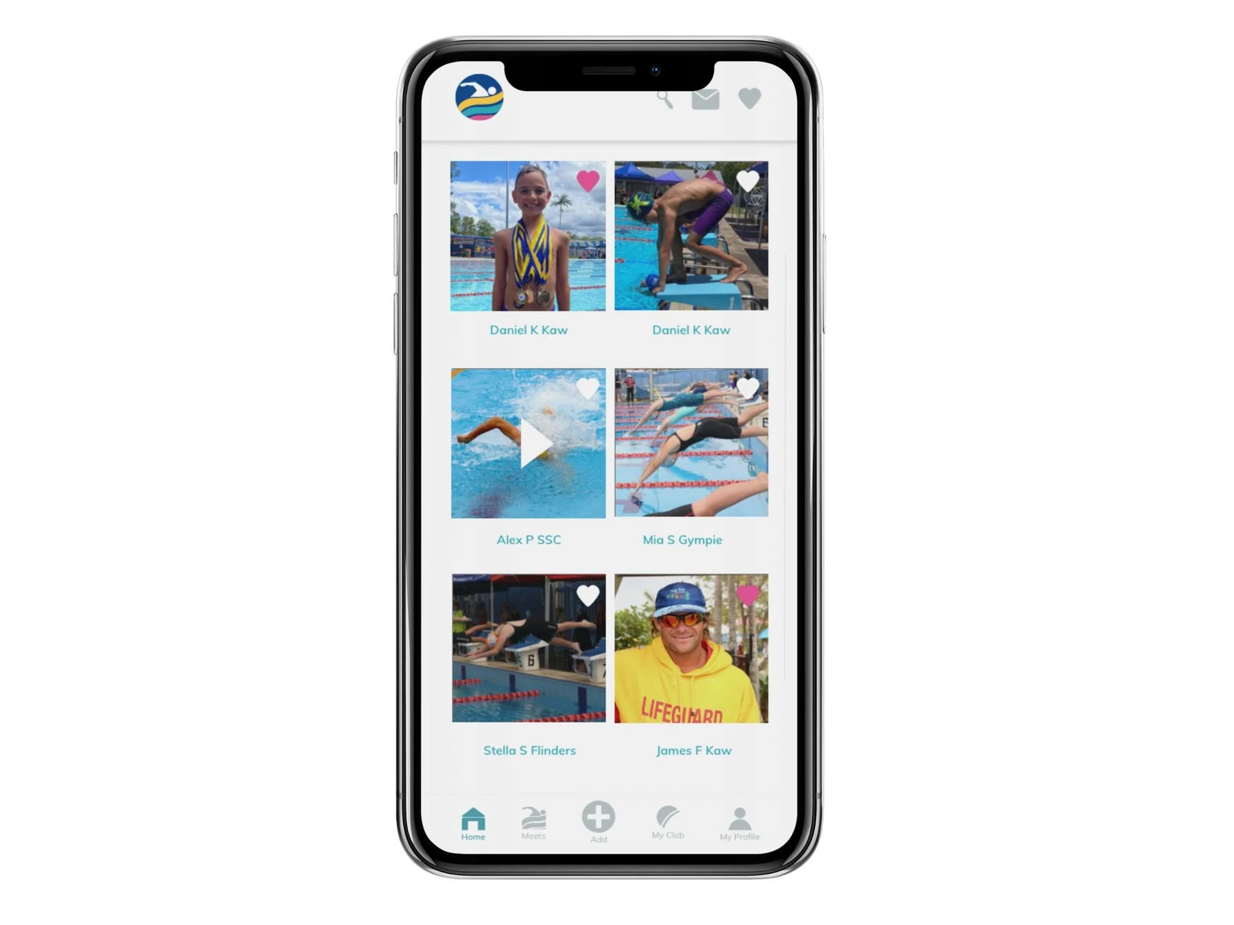
The product experience uses generous white space, a consistent turquoise action colour, large touch targets and familiar social-feed patterns. Persistent navigation keeps meets, clubs, profiles, messages and content close at hand, while simple forms and progressive onboarding reduce effort during account setup, story sharing and membership selection.
Swim Saga’s UX direction grew from interviews and surveys about how swimming families, athletes and coaches share stories, find club information and manage privacy. Personas, scenarios, information architecture and task flows translated those needs into a practical app structure.
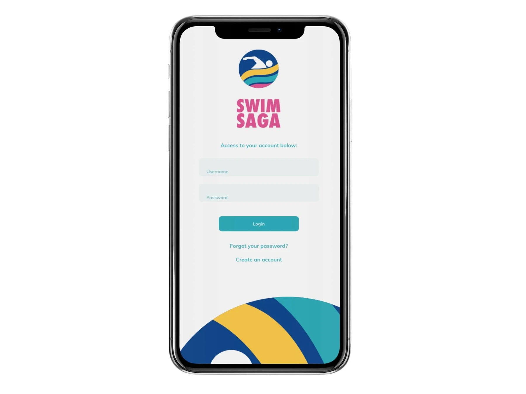
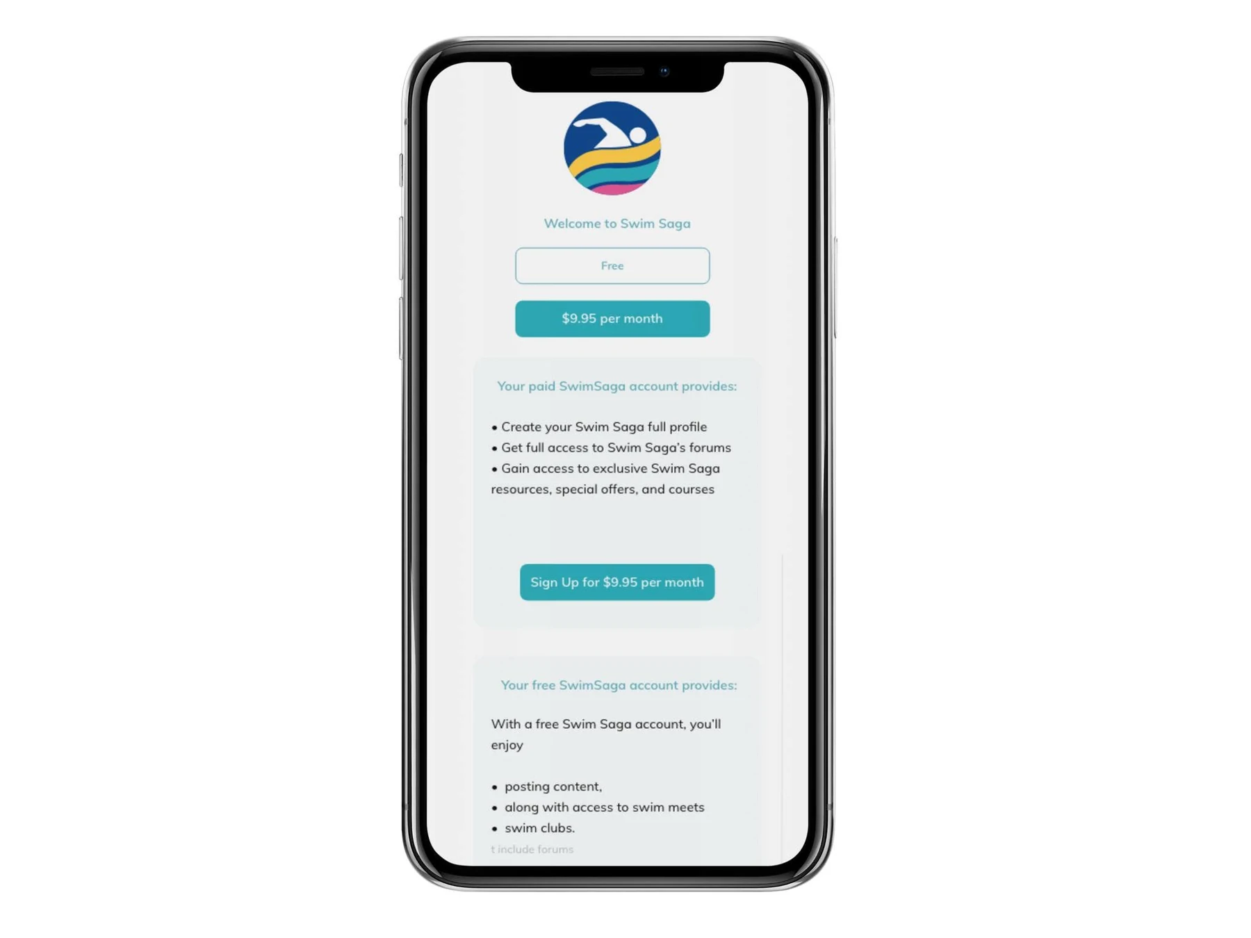
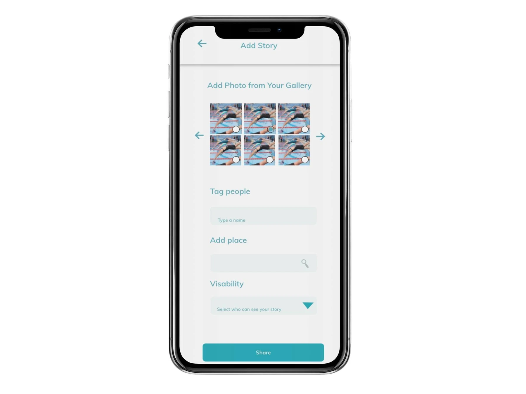
Discovery highlighted mobile access, straightforward registration, relevant content and control over who sees a post. These priorities connect to the app’s sign-up and recovery screens, repeated navigation and visibility choices in the sharing flow.
A documented phone-prototype test with four participants identified further refinements: larger headings, clearer text fields and story-posting steps, plus follower totals for context. The design material shows interface revisions; it does not establish measured live-app results.
 View full size
Interviews, surveys and comparable-app reviews surfaced routines, expectations and points of friction.
Personas and task flows connected the research to account access, club content and audience choices.
Prototype feedback guided readability and posting-flow recommendations, with further testing still important.
Sources: Swim Saga UX Research, p. 7 and pp. 9–18 and 19–30; Swim Sage Styles and prototypes, pp. 6, 11 and 13–16. A summary of the project’s discovery and prototype work, not a claim of statistically representative or post-launch results.
The circular logo works like an app icon while the flowing colour bands suggest water, lanes and forward momentum. The same shapes become flexible interface accents, helping the identity feel consistent from the launch screen through to the web platform.
The interface groups frequent tasks into familiar destinations, giving parents and athletes direct access to schedules, club activity and conversations without making the platform feel crowded.
Upcoming events, schedules and relevant meet information in one predictable place.
Profiles and club spaces that keep member information organised and easy to revisit.
Messages and community communication designed to reduce fragmented group chats.
A friendly feed for sharing photos, videos, results and memorable swim moments.
Clear free and paid options with benefits presented before a user commits.
Simple forms and progressive steps that make account management feel manageable.
Clear headings, quiet form fields and consistent calls to action support a broad audience with different levels of digital confidence. Each screen focuses on one primary task.
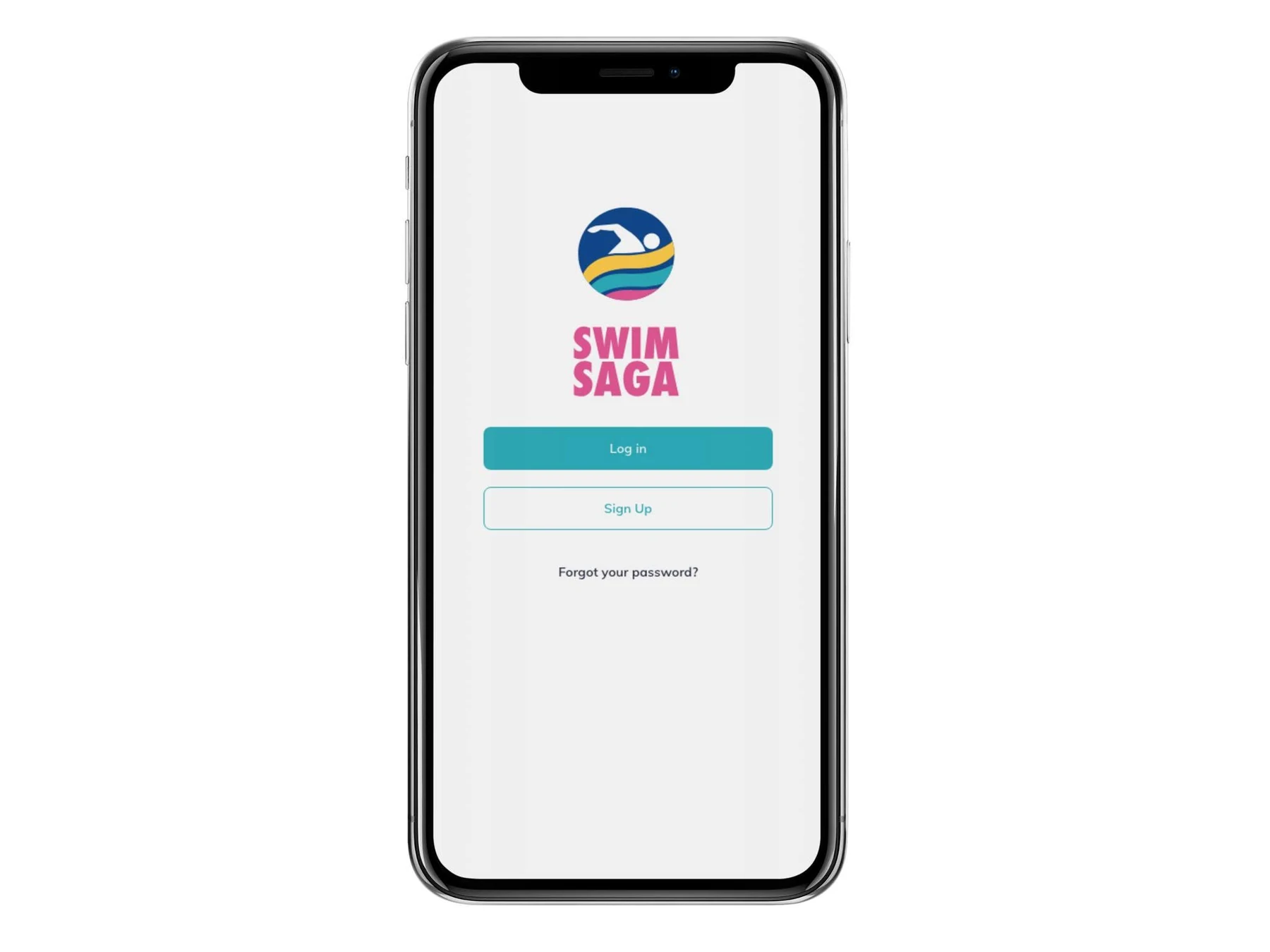
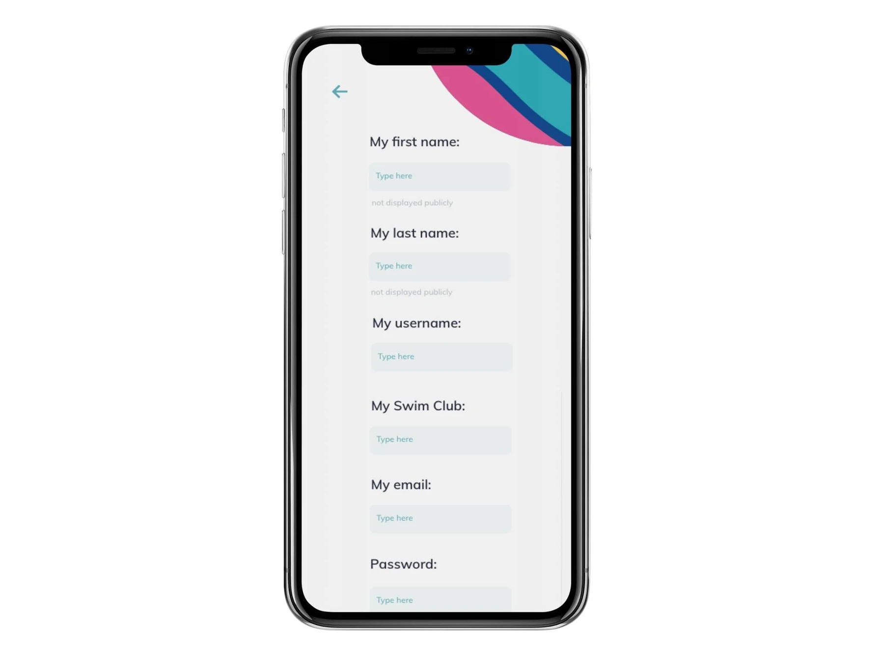
The visual system carries smoothly from the mobile app to the wider web portal. Parents can manage detailed information on a larger screen, while athletes retain quick access to the same content and actions on mobile.
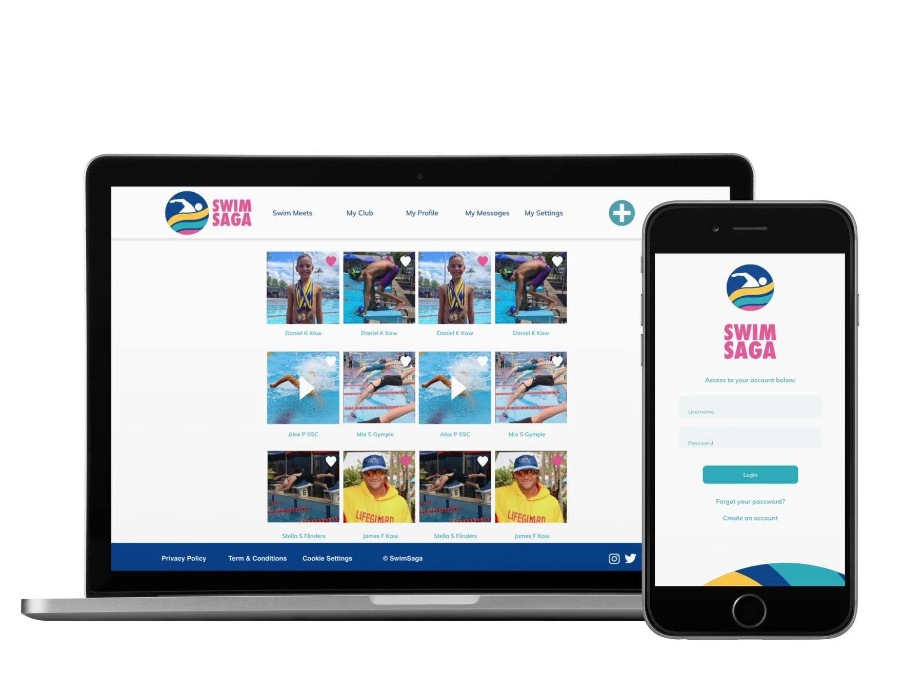
Swim Saga combines bold, memorable branding with a clear product system that supports the everyday needs of swimmers and their families. The final experience feels energetic without becoming noisy, and feature-rich without becoming difficult to navigate—creating one approachable hub for meets, clubs, content, profiles and communication.
Back to our work