ClientQMyVoice
PurposeAssistive communication
ScopeBranding, mobile app and web UX/UI
PriorityAccessibility, clarity and independence
Communication made easier, clearer and more independent.
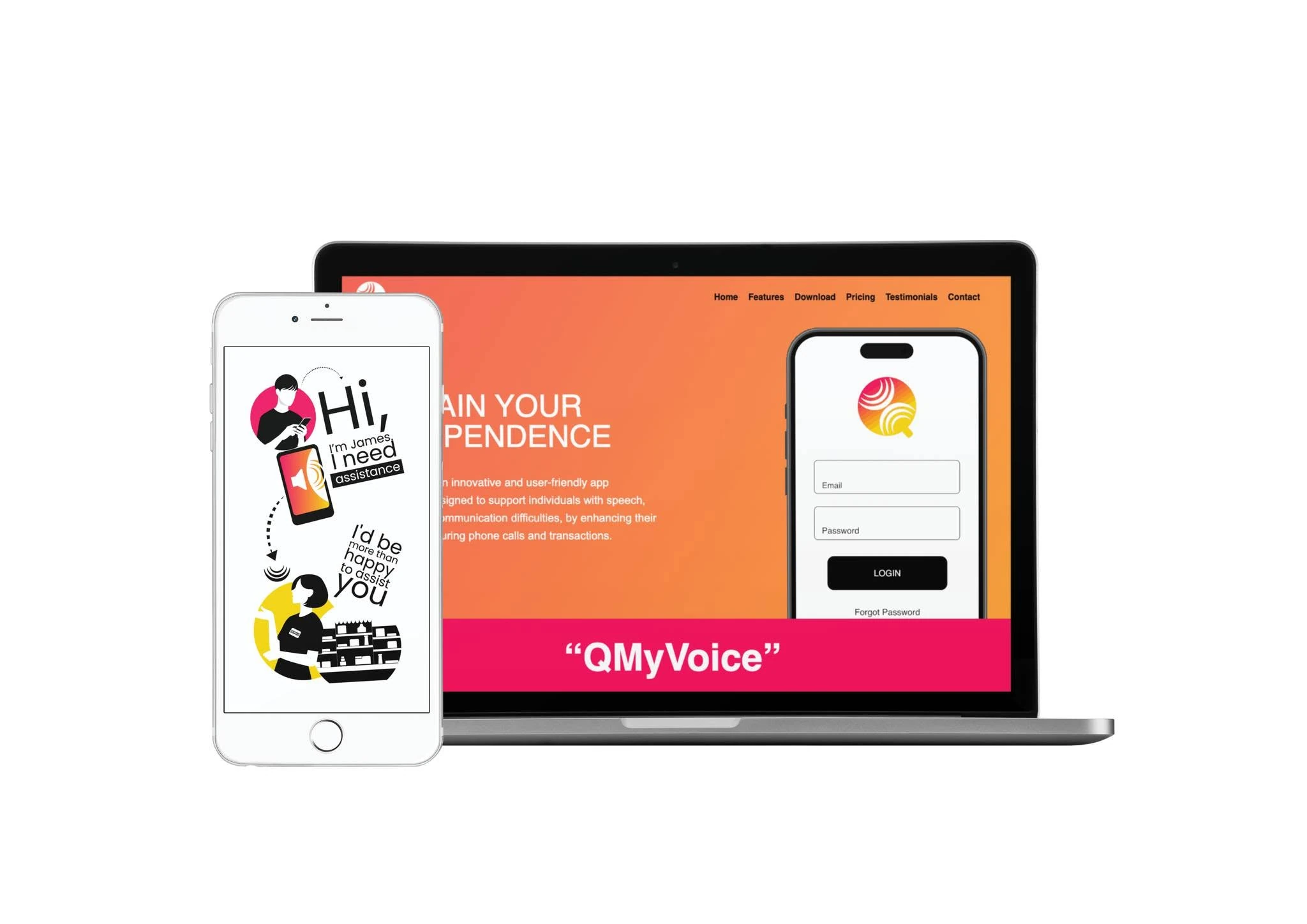
QMyVoice is an assistive communication platform designed to support people with speech disabilities during phone calls and everyday interactions. Cat and Bird Studio developed the visual identity, user experience and interface system from the ground up.
The central design challenge was to make every step understandable for people with different abilities, confidence levels and digital experience. The interface uses plain language, generous spacing, large controls and predictable screen patterns so users can focus on what they want to communicate rather than how the app works.
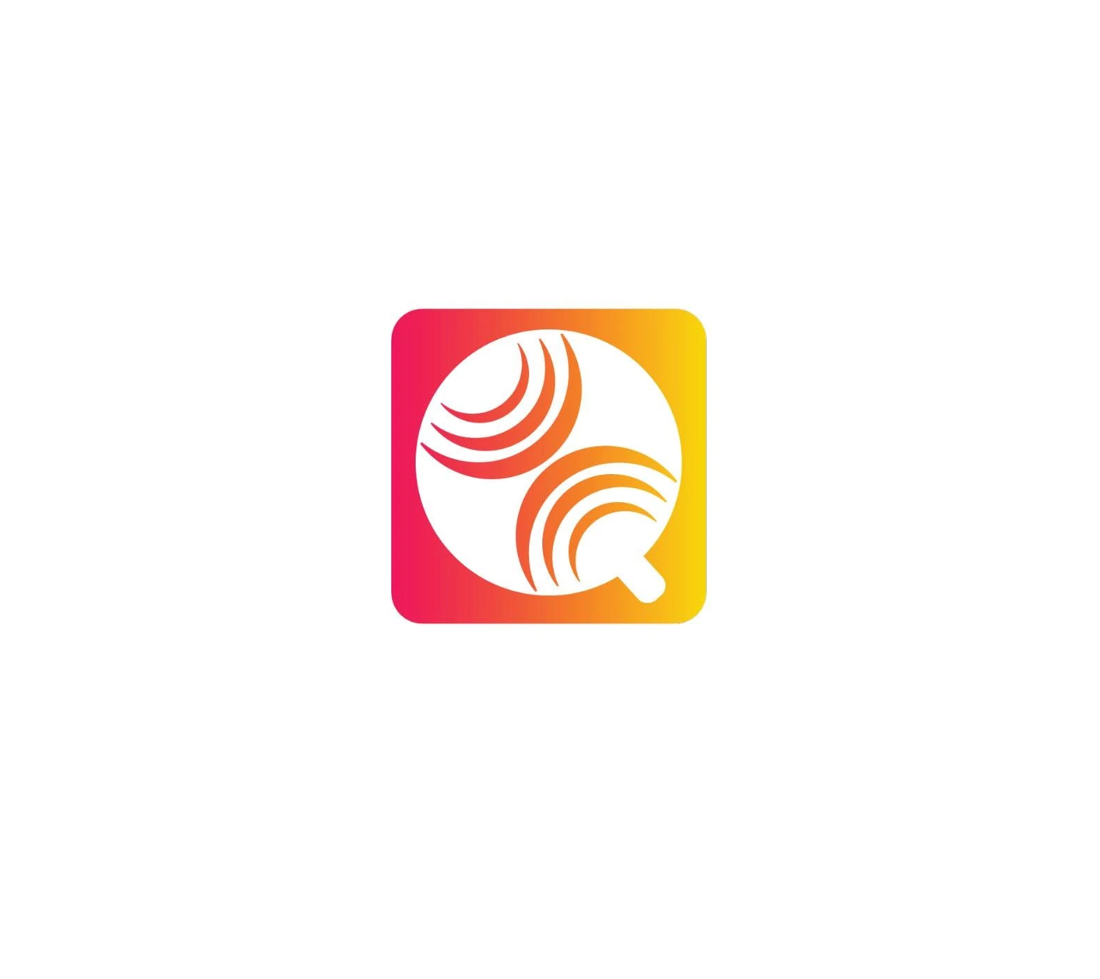
The warm gradient identity combines coral, pink, orange and yellow to feel encouraging and human. A rounded Q-shaped symbol incorporates radiating voice lines, connecting the ideas of speech, sound and personal expression in one compact app icon.
Custom onboarding illustrations explain the calling process visually: select a contact, prepare a message and connect with the person through the mobile call. This reduces reliance on long instructions and makes the service easier to understand before registration.
Warm, confident
and easy to recognise.
The identity balances a bright, optimistic gradient with strong black typography and white space. This creates personality while preserving contrast and readability across app screens, web pages and printed collateral.
Illustrations use simplified people, large gestures and clear directional cues to communicate scenarios quickly and inclusively.
Confidence at
every step.
Brand identity and assistive app icon
Accessible information architecture and user flows
Plain-language onboarding and visual tutorials
Large form fields, buttons and predictable controls
Account, call and settings interface design
Responsive web presentation and landing pages
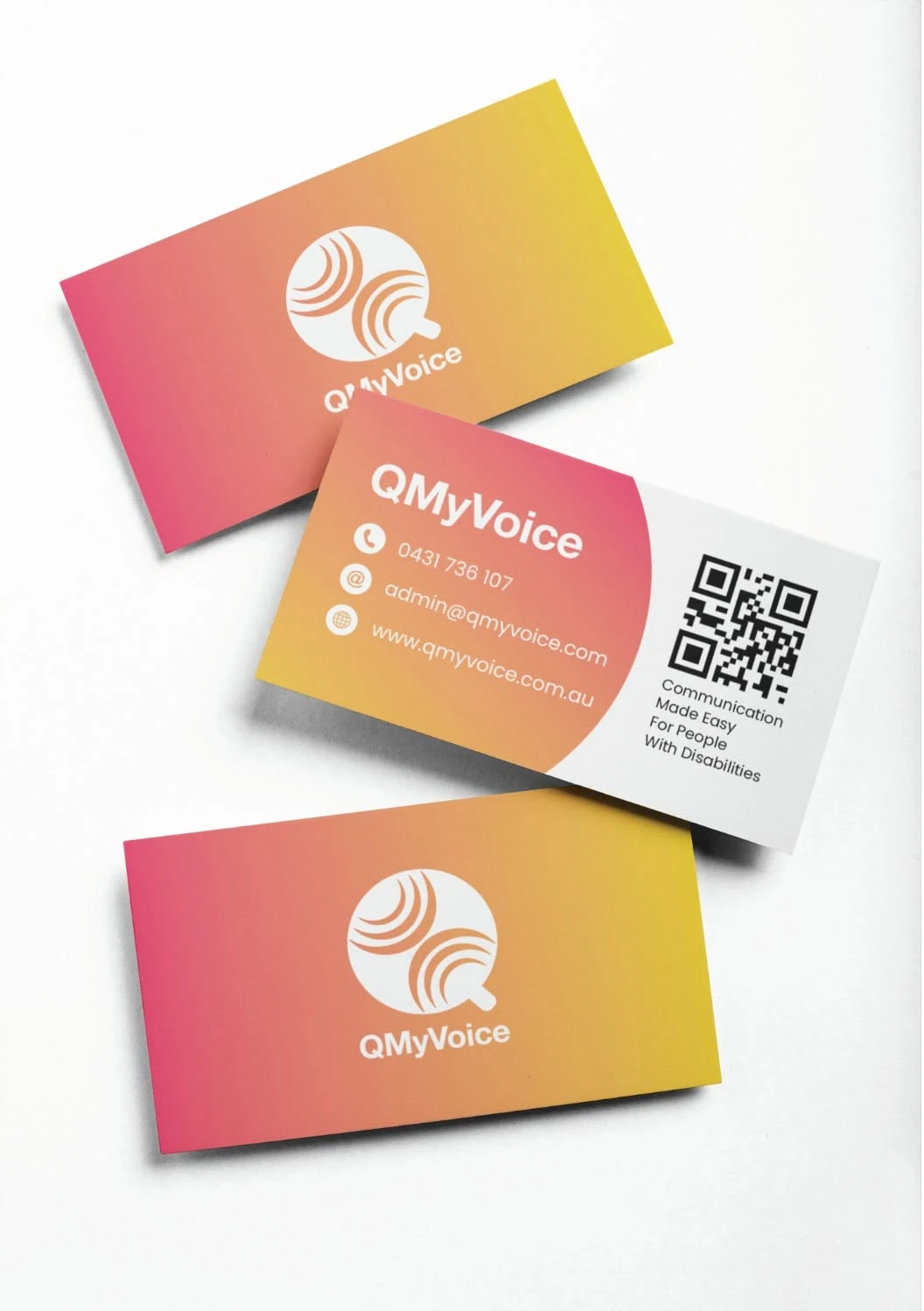
Business cards and accessible QR touchpoints
Explained visually.
Used intuitively.
Clear onboarding, consistent controls and focused screen layouts reduce cognitive load. The design keeps secondary actions quiet and makes the primary next step obvious.
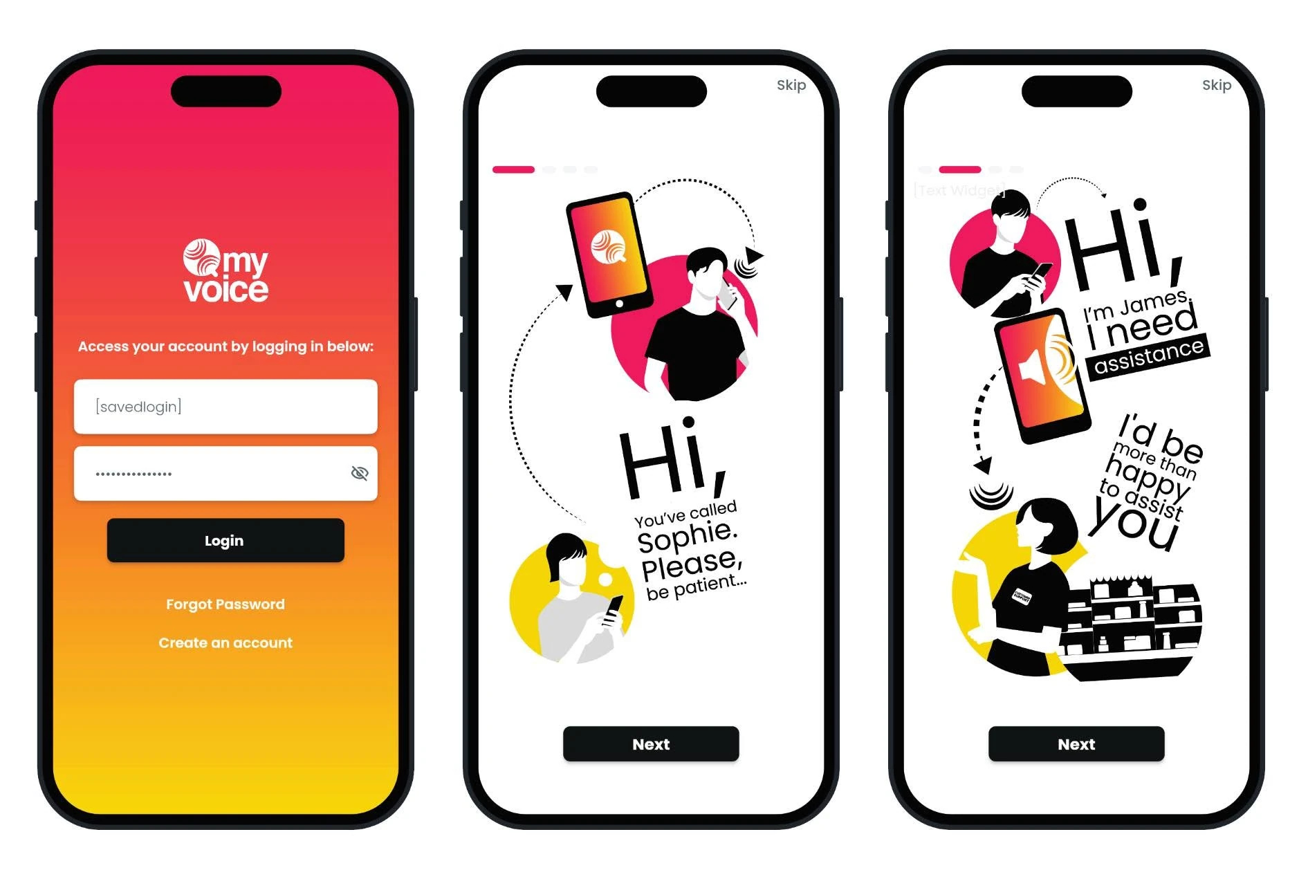
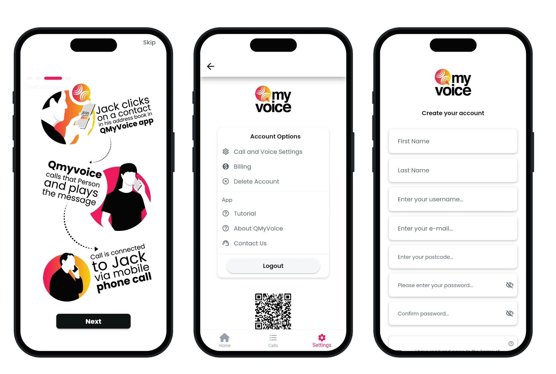
An empowering interface built around clarity and personal control.
QMyVoice demonstrates how accessible design can feel both practical and expressive. The completed identity and digital system help users understand the service, complete key tasks with less effort and communicate with greater confidence and independence.
Back to our work