ClientQueensland Aviation Museum
ScopeMagazine and visitor guide
DisciplinesEditorial, photography & illustration
FormatPrint publication
Technical history translated into an energetic and easy-to-read publication.
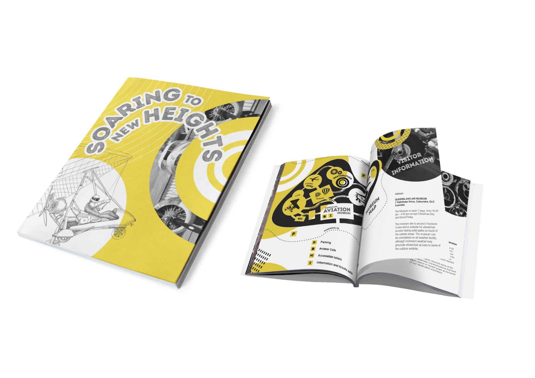
Cat and Bird Studio designed a visitor magazine for Queensland Aviation Museum, combining clean editorial layouts, strong visual storytelling and a smooth reading experience.
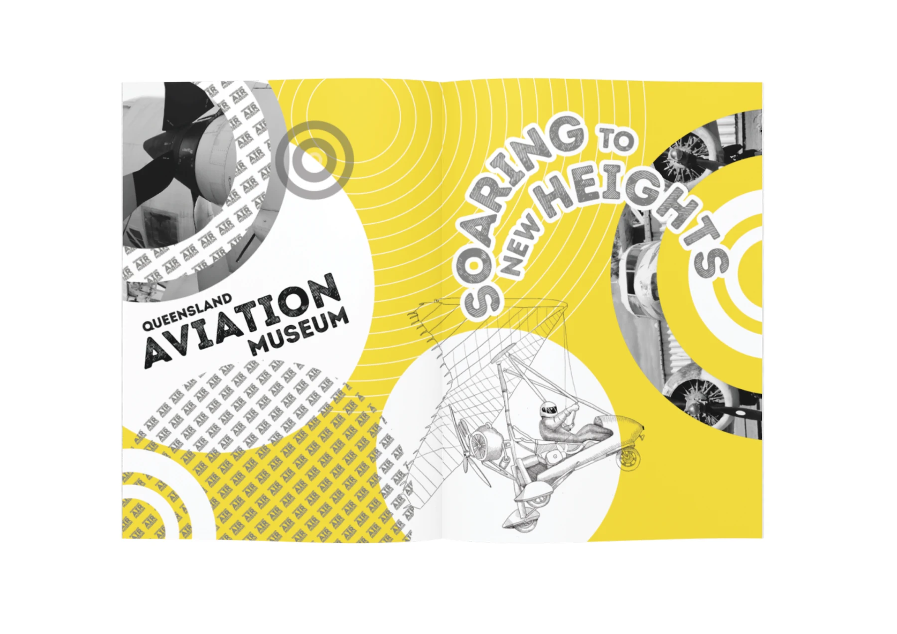
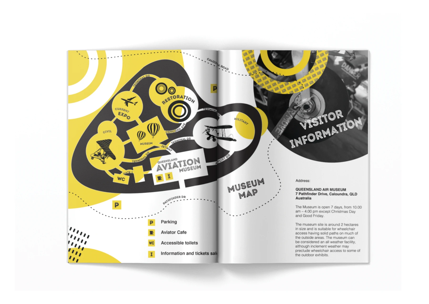
The bold yellow, black and white palette takes cues from aviation signage and caution markings. Circular forms, repeated patterns and dotted flight paths create movement through the publication while giving each section a clear visual identity.
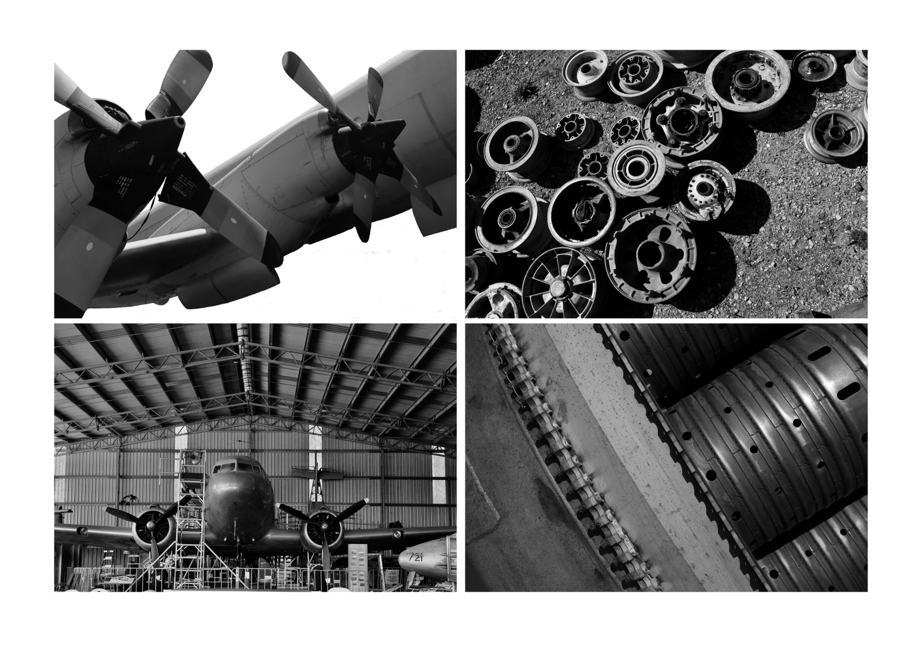
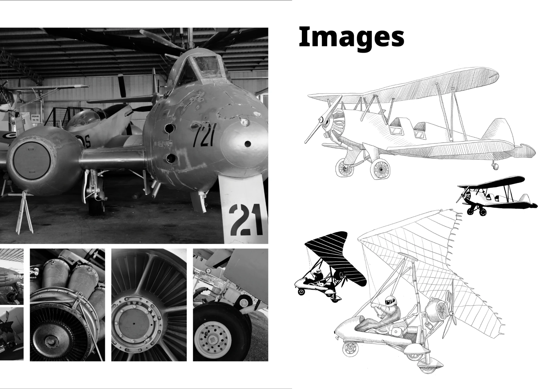
Original photography captures aircraft, mechanical components and restoration textures inside the museum. Custom hand-drawn aircraft illustrations introduce a more personal, crafted layer and help balance the technical subject matter with an accessible tone.
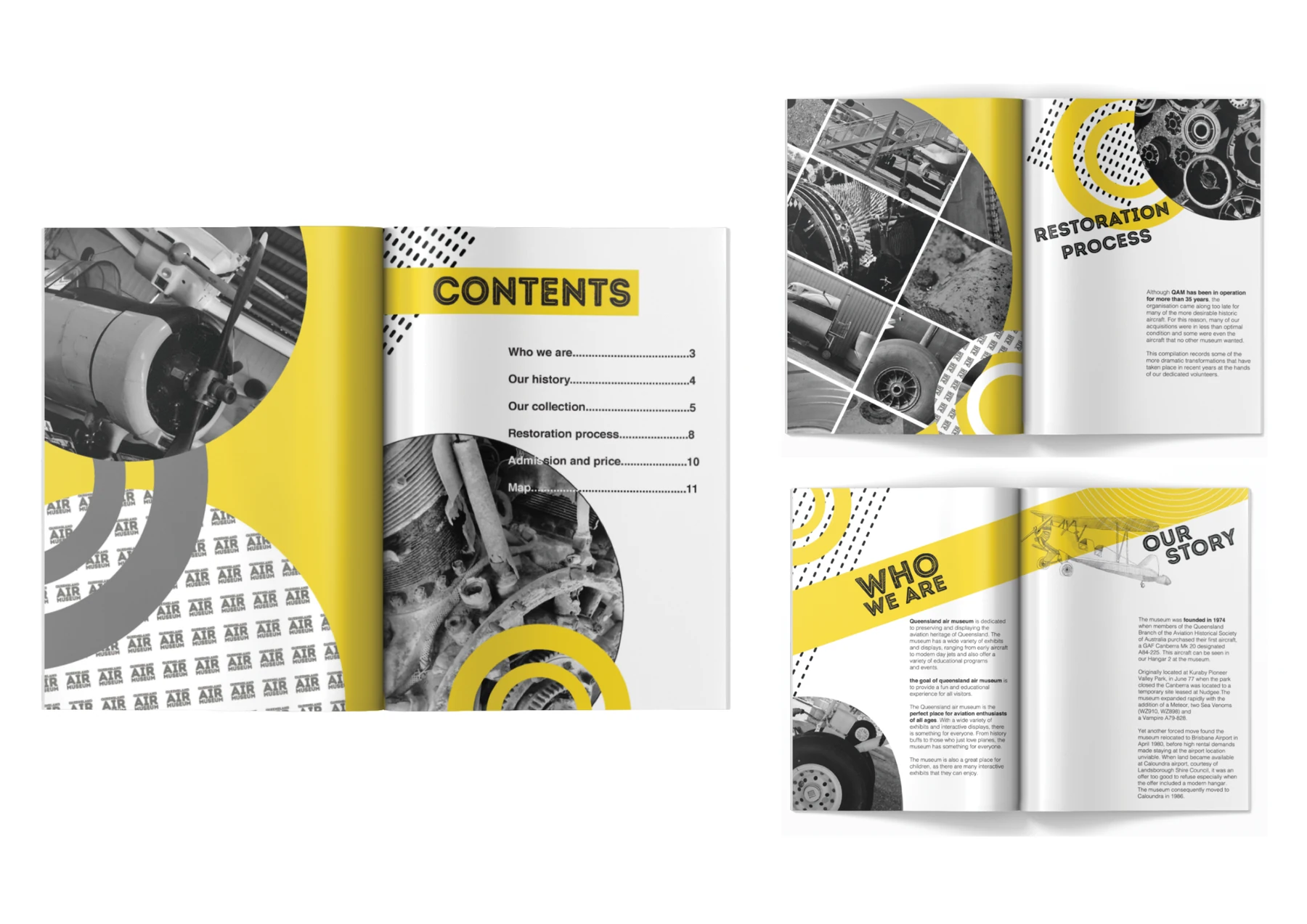
A consistent grid, clear headings and concise information blocks guide readers through the museum’s history, collection, restoration process, visitor details and map. The result works equally well for quick orientation and more considered reading.
High contrast.
Clear direction.
Aviation yellow carries energy and visibility, while black-and-white imagery gives the historic material consistency. Concentric rings, mapped routes and typographic labels form a flexible navigation system across the spreads.
A complete editorial
storytelling system.
Editorial concept and art direction
Magazine layout and grid system
Cover design and visual navigation
Original museum photography
Custom hand-drawn aviation illustrations
Visitor map and print-ready artwork
Every spread has a role.
Every page keeps moving.
Large image fields establish atmosphere, compact content blocks support practical information, and recurring shapes connect the story from the contents page through to the museum map.
Photographed on site.
Illustrated by hand.
Close-up photography records the material detail of engines, aircraft and restoration work. Hand-drawn planes extend that source material into a distinctive illustration style used throughout the publication.
Designed to inform.
Made to be kept.
The final publication feels energetic in hand while retaining the clarity expected from a practical visitor guide.
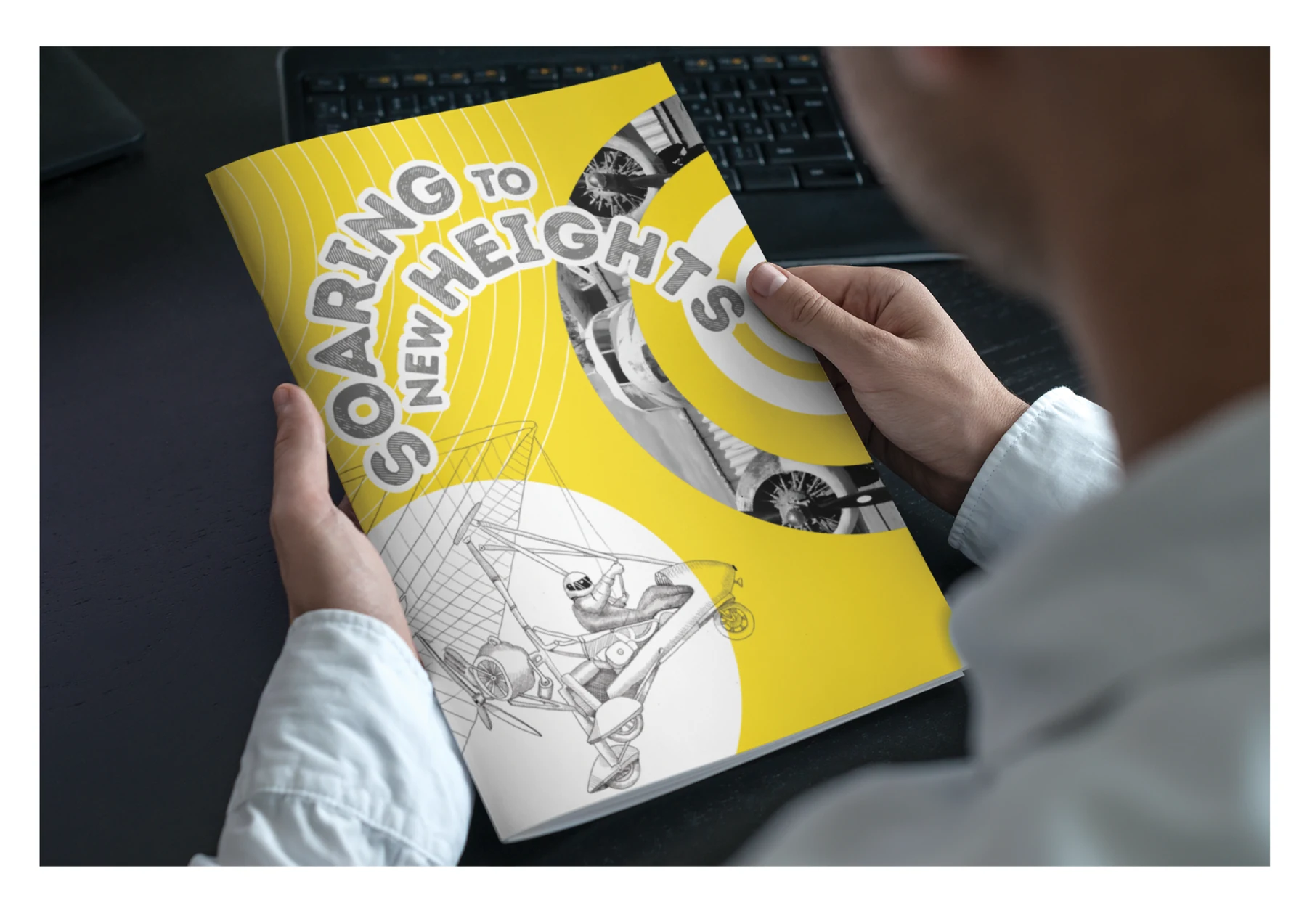
A bold museum publication that makes complex information clear and engaging.
The magazine brings together original content, custom illustration and a disciplined editorial system. Strong contrast gives the publication immediate presence, while the grid and navigation devices create an intuitive flow from story-led features to practical visitor information.
Back to our work