
ClientCosy Cubs
IndustryBaby and toddler care
ScopeBranding, packaging and illustration
ApproachGentle, playful and parent-friendly
A nurturing baby-care brand with a playful Australian character.
Cosy Cubs needed a visual identity that would feel safe and gentle to parents while remaining bright and memorable on shelf. Cat and Bird Studio created a soft, playful system built around friendly custom characters, simple typography and product-specific colour palettes.
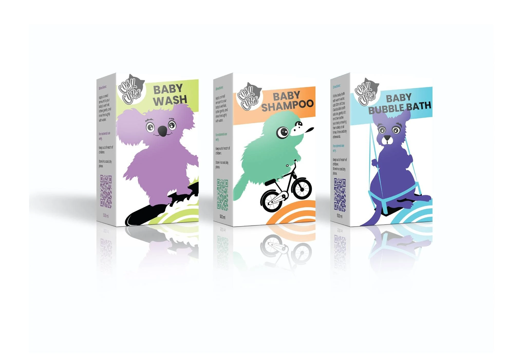
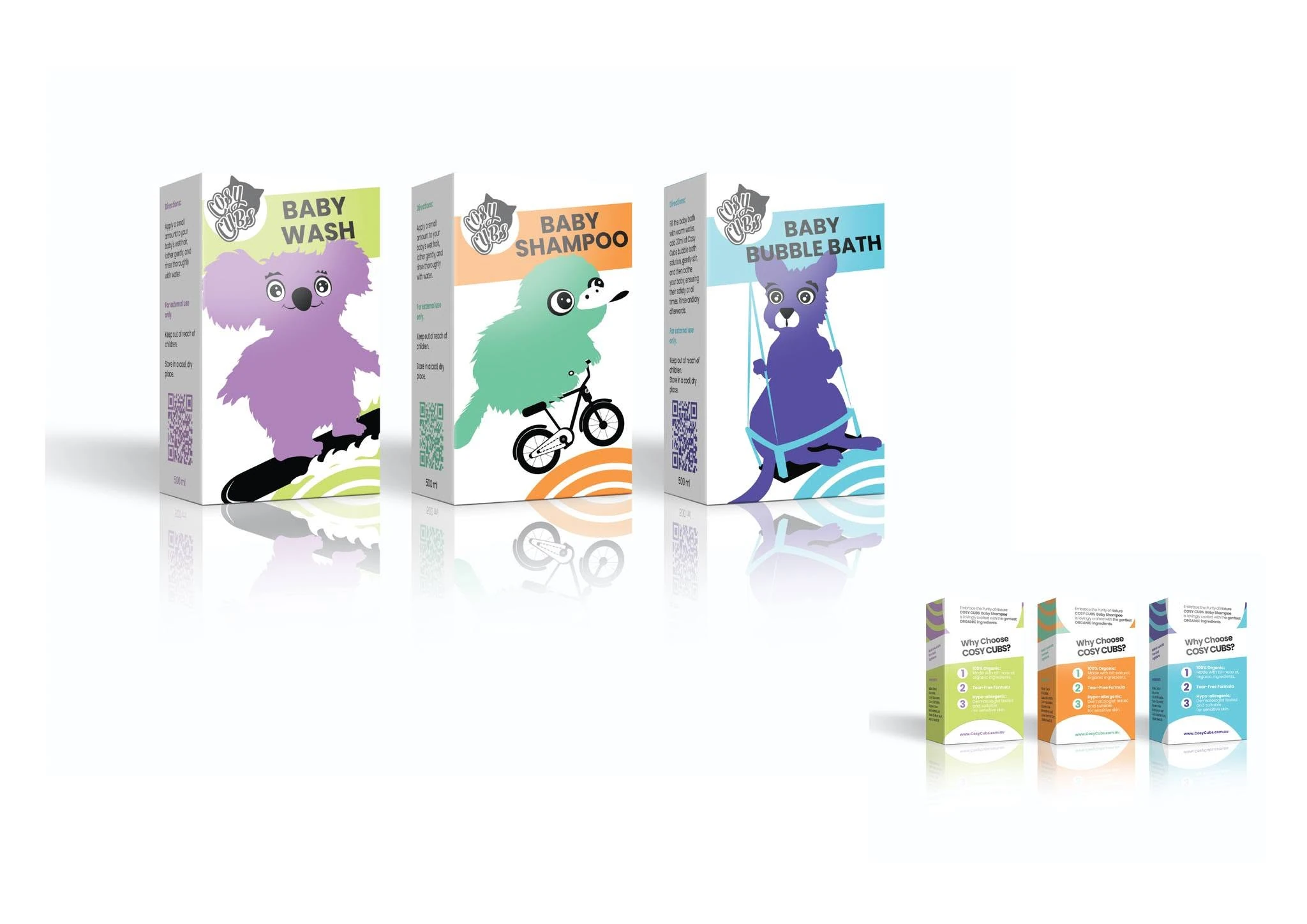
Each product is represented by its own illustrated animal and accent colour. This makes the range easy to distinguish at a glance while allowing the products to feel connected as one family. Rounded forms, concentric wave motifs and generous white space keep the packaging approachable and contemporary.
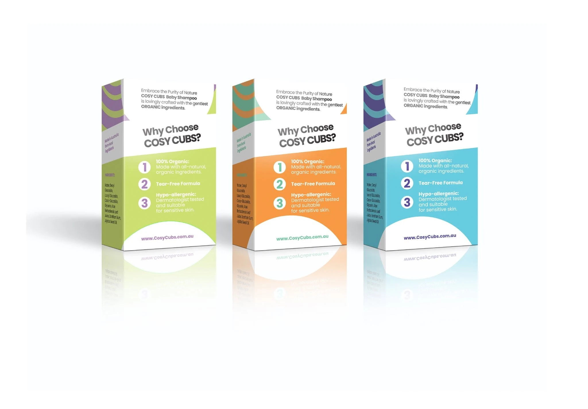
The information hierarchy places the product name and character first, followed by clear benefits, directions and ingredient information. This helps busy parents scan the packaging quickly without losing the warmth and personality of the brand.
Friendly characters.
A flexible product family.
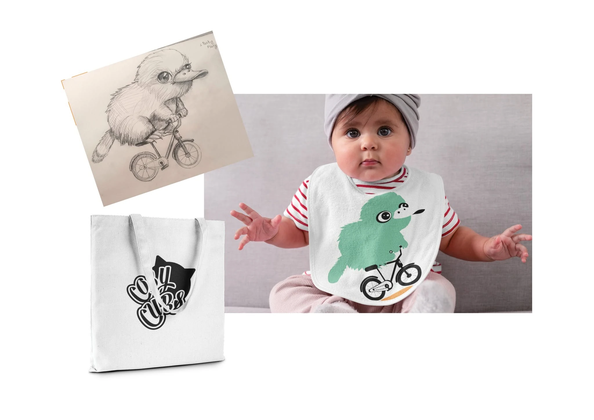
Original animal illustrations were developed to give each product its own personality. Their simple silhouettes, expressive eyes and playful activities create a distinctive brand world that can extend across packaging, clothing, bags and future product lines.
The black-and-white Cosy Cubs wordmark provides a consistent anchor, while pastel mint, orange, aqua, lavender and lime identify individual products.
A complete
care-product identity.
Brand identity and custom wordmark
Original animal character illustration system
Product range colour coding and graphic motifs
Front, side and back packaging hierarchy
Benefits, directions and ingredient information design
Baby apparel and merchandise applications
Easy to recognise.
Easy to trust.
Every pack combines a large character, clear product title and simple benefit hierarchy. The family resemblance remains strong, while colour makes each formula instantly identifiable.

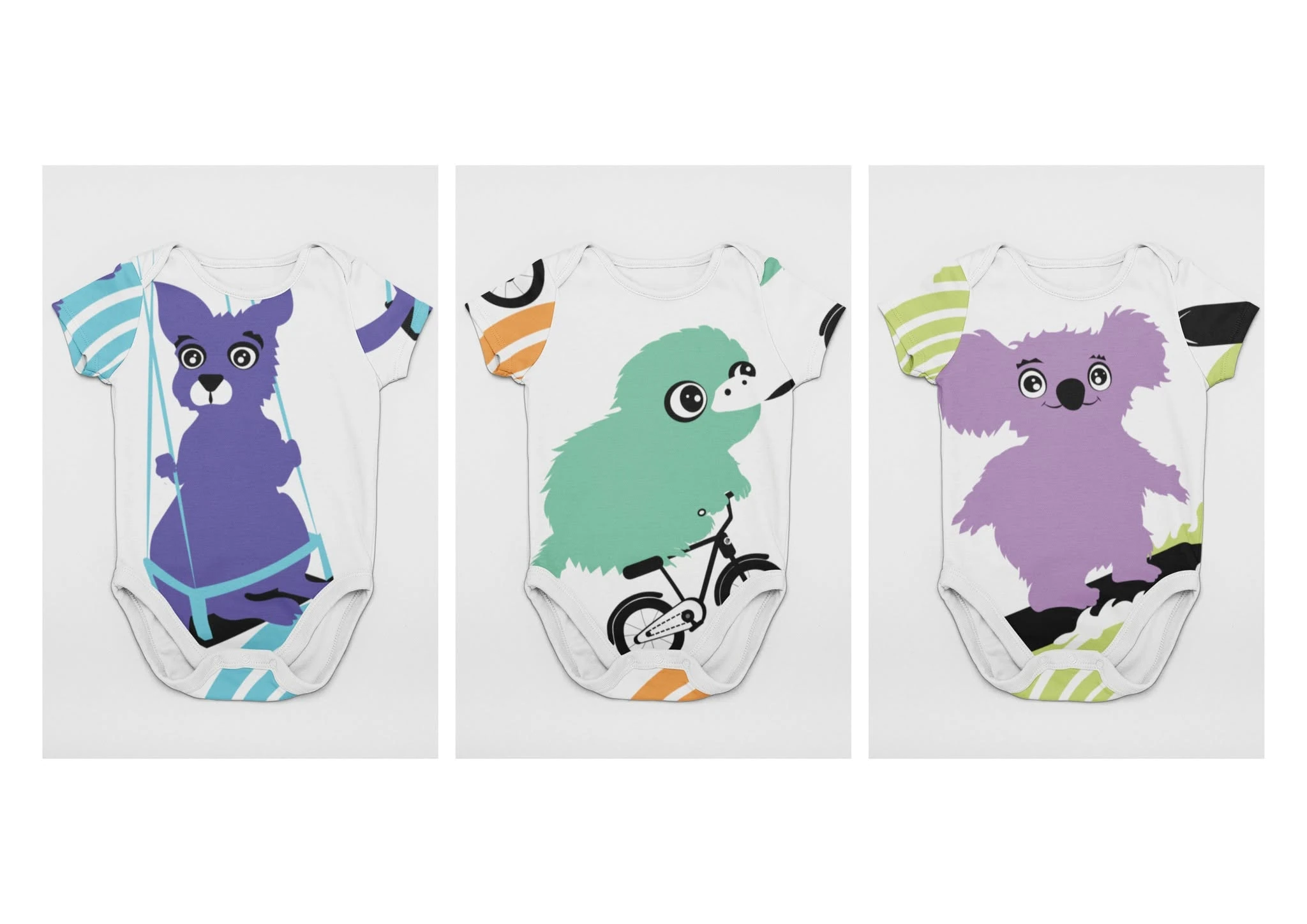
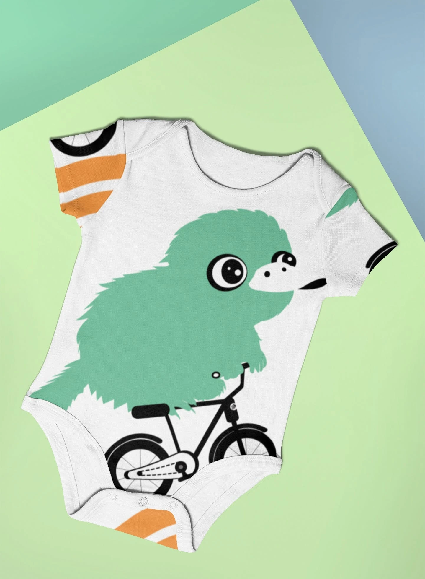
A warm, flexible identity designed to grow with the product range.
The final system combines parent-friendly clarity with distinctive character illustration. It feels gentle enough for baby care, playful enough to appeal to families and practical enough to remain consistent across packaging, garments and retail collateral.
Back to our work